7 Ways to Make Your Website More Accessible
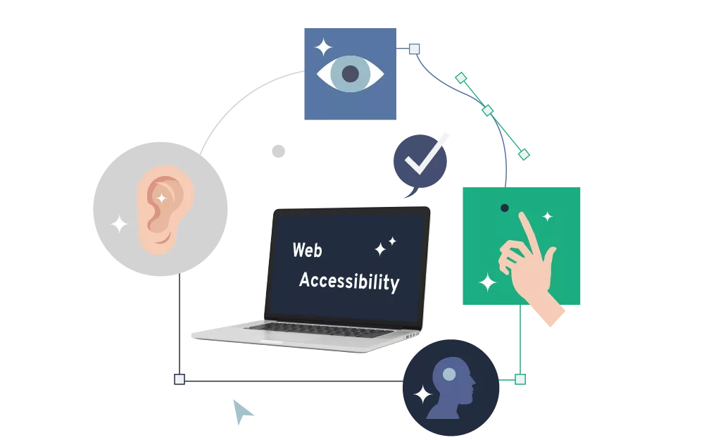
To make sure your content reaches as many people as possible, it's important to increase the web accessibility of your website. We'll show you 7 tips to remove barriers and make your content more inclusive. This way, even more people can take advantage of the digital world.

The Internet has opened many doors for us and made information accessible to a broad public. However, some content remains unavailable to many people in society because it is not built to be accessible enough to meet the needs of some groups. Mostly due to barriers that were created without even realizing that they limit the access.
According to the WHO, a total of 16% of the world's population lives with a disability - in other words, 1.3 billion people who are potentially excluded from content on the internet. This is especially problematic when it comes to information that is relevant to all people and in which there is a public interest. In Austria, therefore, web accessibility in the public sector is legally defined by the Web Accessibility Act. This aims to ensure that important information that is relevant to the general public is also sufficiently accessible to all people.
But also outside the public sector, we should make sure that everyone in society has the same chance to take advantage of the digital world. We'll show what options there are for making content inclusive later in this article. But before that, we would like to clarify the important question of what web accessibility actually means.
What Does Web Accessibility Mean? #
The buzzword accessibility is often mentally linked to disabilities, and that is undoubtedly an important aspect here as well. When it comes to barrier-free access to the Internet, however, many other things are important besides disabilities. After all, the needs and requirements of people are as diverse as our society is. For example, barriers to content can exist if it is more difficult to access for people with fewer technical capabilities or know-how. The same applies when texts are formulated in complicated language that requires a specific level of knowledge or formal education.
Many considerations about accessibility on the Internet are based on the Web Content Accessibility Guidelines (WCAG) 2.1. which cover the following 4 principles in their basic structure:
- Perceivable: Information and user interface components must be presentable to users in ways they can perceive.
- Operable: User interface components and navigation must be operable.
- Understandable: Information and the operation of user interface must be understandable.
- Robust: Content must be robust enough that it can be interpreted reliably by a wide variety of user agents, including assistive technologies.
If any of these conditions are not met, there will be people who cannot access the content.
Remove Barriers to Reach More People #
In this article, we can only give an overview of some important aspects that can be used to reduce barriers. The Web Content Accessibility Guidelines (WCAG) can provide additional guidance.
1. Contrasts and Colors #
An important requirement is to have suitable designs in which there is sufficient contrast between the background and the text. This ensures that the content is easy to read and can also reach people with visual impairments, which includes a large number of the population over the age of 50. At the same time, this creates a better perceptibility of the content for people with specific impairments (e.g. color blindness or red-green deficiency).
2. Structured Content for Assistive Technologies #
In the case of visual impairments that no longer allow the website to be read with the eyes, assistive technologies - for example screen readers - can be used to have the content read aloud. Since screen readers access the source code and thus reproduce the content, an important prerequisite is that the website or application is also well structured and enables useful, easily understandable output.
Here, it is important to ensure that the content can be presented in linear form. You can think of this as "turning off" the layout: In most cases, content is graphically prepared for output on desktops or smartphones, has a specific position, and has other design features. In order for the content to also function linearly (by becoming a list), the structure of the elements must be logical and the functions of the page must be structured very clearly.
3. Simple Navigation #
Navigation should be as simple and intuitive as possible so that content can be found easily and it is easy to switch between pages and functions. In addition, all content and functionality should be accessible with the keyboard to enable usability without a mouse or touchpad. This aspect is often ignored, but it can create a high barrier for people with physical disabilities, which can result in information being not available to them.
4. Understandable Language #
Complex language can create barriers. If content is presented in a way that is easy to understand, it is offered in a more inclusive way and you create accessibility for people with cognitive disabilities. The second benefit is: You also make life easier for many people who have had little to do with the topic of your content or have only a limited understanding of the used language.
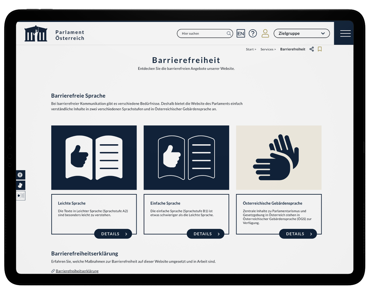
One example of this is the Austrian Parliament, which offers some content in "easy language" (language level A2), "simple language" (language level B1) and sign language.
5. Subtitles for Videos #
To make videos accessible to deaf people, it is worth subtitling them. Subtitling can also offer a second advantage: There are often situations in everyday life in which you just don't want to turn on sound - for example, in public transport or waiting rooms. The subtitled videos offer the advantage that they can be viewed in such situations without sound, but still with the full content.
6. Option to Resize Text #
If users require increased font size, it is necessary that the layout is flexible enough to allow resizable texts without any problems. Special care should be taken to ensure that the font size of all texts can be increased by page zoom.
7. Alternative Texts for Images #
Screen readers cannot "read" images, of course. Here, alternative texts (so-called alt tags) that describe the content on the images can help to make these elements more accessible as well. Especially for images that are not only shown for visual reasons, but are meant to provide additional information (e.g. infographics), it makes sense to provide alternative texts so that people with impaired vision can also access the information with assistive technologies.
Alt tags are not only useful for making content more accessible to people, however, they can also help search engines understand the content better. After all, search engines can't "see" images either. So by using the tags you can make the content/images more understandable for search engines as well, and in the best case scenario increase your visibility.
Optimization as a Process #
With this overview, we want to raise awareness, because every single optimization can make many people's lives easier and give them better access to information. However, accessibility on the web should above all be seen as a continuous process, because technologies change. Websites and web applications should therefore be continuously improved and checked for their accessibility.
In addition, search engines also evaluate the accessibility of web content. If you want to perform well in the search engine rankings, it is worth paying attention to accessibility on an ongoing basis.
You want to evaluate and optimize your website on accessibility? We will be happy to talk to you about your options in a free initial consultation. Feel free to contact our team, we are looking forward to hearing from you!


 Jürgen Fitzinger
 Michaela Mathis
